Custom Retractable Banners: Design Tips for Maximum Impact
Your retractable banner is the tallest element in your booth — make it count. Design tips, sizing, and common mistakes to avoid for trade show banners.
Why Your Banner Design Matters More Than You Think
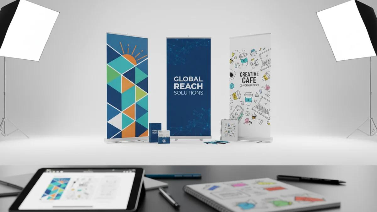
A retractable banner stand is the single tallest branding element in a standard 10x10 trade show booth. Standing 6-8 feet tall, it's visible from much farther away than anything on your table. That makes it your first impression — and often your only chance to get someone's attention as they walk by.
The problem is that most banner designs try to do too much. They cram in every product, every tagline, and every logo, resulting in a cluttered mess that no one reads. Let's fix that.
The Anatomy of a Great Banner
Think of your banner in three zones:
Top Zone (Eye Level From Distance)
This is the most important real estate on your banner. From 15-20 feet away, only the top portion is visible above the heads of other attendees.
- Your logo — large, clear, unmistakable
- A bold headline — what you do in 5 words or less
Middle Zone (Eye Level Up Close)
Once someone is standing in front of your booth, this is what they see:
- Key benefits — 3-4 bullet points maximum
- Supporting image — a product photo or hero image
Bottom Zone (Below Eye Level)
The least-read section, so keep it simple:
- Website URL
- QR code — linking to a landing page or contact form
- Social media handles — optional
The 10-Foot Rule
This is the most important design principle for trade show banners: your banner must be readable from 10 feet away.
That means:
- Your company name should be at least 2-3 inches tall on the printed banner
- Your headline should be at least 1.5-2 inches tall
- Body text should be at least 0.75 inches — but honestly, minimize body text entirely
Before approving your design, print it at scale (or zoom to actual size on screen) and step back 10 feet. If you can't read everything, simplify.
Typography Rules
- Maximum 2 fonts. One for headlines, one for body text. Using more than two fonts looks chaotic.
- Sans-serif for headlines. Helvetica, Arial, Gotham, Montserrat — clean and readable at distance.
- Bold and heavy weights. Thin fonts disappear from across a trade show floor.
- High contrast. Light text on dark background or vice versa. Never gray text on a slightly different gray.
Color Strategy
Your banner colors should accomplish two things: represent your brand and create contrast.
| Color Combination | Impact | Best For |
|---|---|---|
| Dark blue + white | Professional, trustworthy | Corporate, B2B |
| Black + bright accent | Bold, modern | Tech, creative |
| White + brand color | Clean, open | Healthcare, education |
| Brand color + contrasting text | Branded, recognizable | Established brands |
Avoid: Red text on blue backgrounds, yellow text on white, or any combination where the text and background are similar in value (lightness/darkness).
Image Quality Requirements
Nothing screams "amateur" like a pixelated banner. Here are the file requirements:
- Resolution: 150 DPI at full size (for large format printing)
- Color mode: CMYK (not RGB)
- File format: AI, EPS, or high-res PDF preferred; PNG at 300 DPI acceptable
- Bleed: Add 0.5" bleed on all sides
Common Banner Design Mistakes
1. Too Much Text
This is the number-one mistake. Your banner is not a brochure. Nobody is going to stand in a crowded aisle and read a paragraph. Limit yourself to a headline and 3-4 short bullet points maximum.
2. Logo Too Small
Your logo should be large enough to identify from 15+ feet away. If it's the same size as your body text, it's too small.
3. No Clear Hierarchy
When everything is the same size and weight, nothing stands out. Create a clear visual hierarchy: logo > headline > supporting points > contact info.
4. Low-Quality Images
That 72 DPI image from your website will look terrible printed at 33" x 81". Always use high-resolution source files.
5. No Call to Action
What do you want someone to do after reading your banner? Visit your website? Scan a QR code? Talk to your team? Make it obvious.
Standard Banner Sizes
| Size | Width x Height | Best For |
|---|---|---|
| Economy | 24" x 79" | Tight spaces, side accents |
| Standard | 33" x 81" | Most trade show booths (most popular) |
| Wide | 36" x 92" | Larger booths, higher visibility |
| Double-sided | 33" x 81" | Open floor placement, visible from both sides |
Pairing Banners With Your Booth Setup
Retractable banners work best as part of a complete booth design. Pair them with:
- A matching custom table cover for brand consistency
- A table runner that echoes the banner's color scheme
- Giveaway items displayed on the table to draw people in
For the complete booth setup guide, read how to set up a trade show booth that attracts crowds.
And for the full event preparation guide, see our trade show marketing pillar post.
Ready to order? Visit the retractable banner stands product page or request a quote for custom sizes and quantities.
Ready to Order Custom Promotional Products?
Get professional mockups and bulk pricing within 24 hours
Get Your Free QuoteRelated Articles

Custom Packaging for Small Business: Getting Started on a Budget
Custom packaging doesn't require a big budget. Learn how small businesses can create professional branded packaging for under $1 per order with smart, strategic choices.
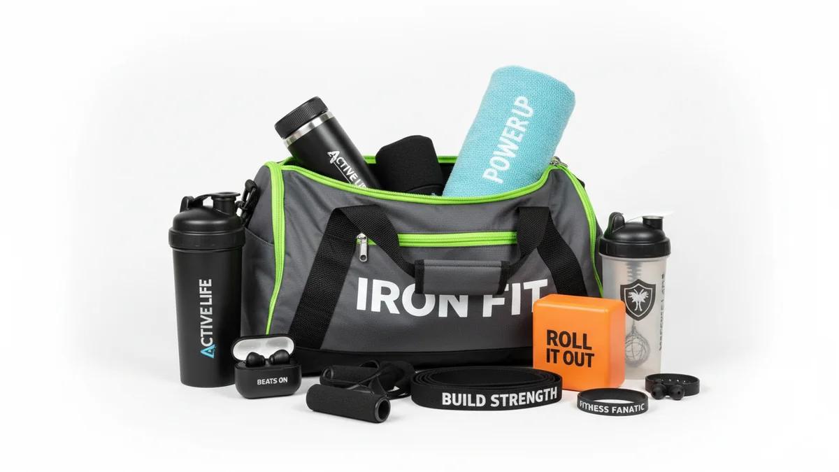
Gym and Fitness Promotional Products That Get Used Daily
The best fitness promotional products are the ones that get used every day. From foam rollers to yoga mats, discover branded gym products that deliver ongoing brand exposure in fitness environments.
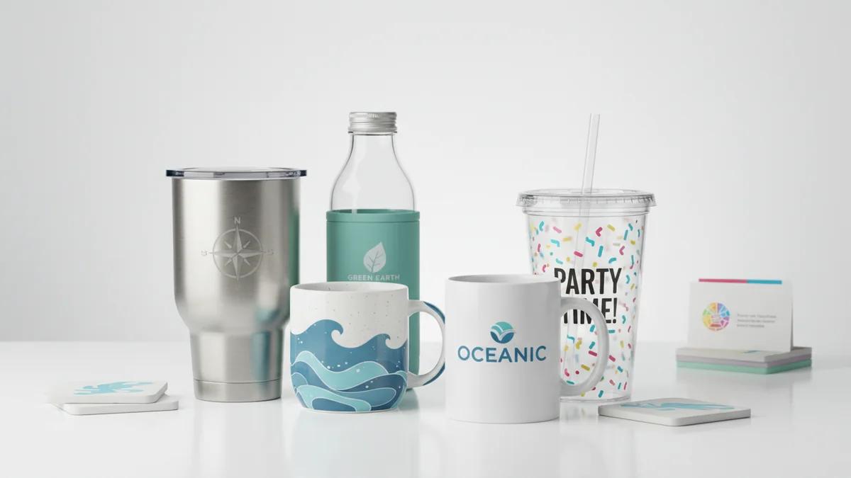
How to Choose the Right Custom Drinkware for Your Brand
With so many custom drinkware options available, choosing the right one for your brand can be overwhelming. This guide breaks down the decision by audience, budget, event type, and brand personality.